
.png)
As some of you may have instinctively suspected earlier this year when I offered up a half-yearly report on the best sleeves of 2013, MRD is notorious for inspecting way sooner than that of the musical content when it comes to critiquing a particular record. For it is the album cover: the artwork, the design, the layout, the particular nusances that a picky OCD-leaning fellow like myself that plague my thoughts in hopes of landing a list that best sums up the pinnacle of the year's visuals. But I'm not alone on my quest, no sir'ee. There will be no lone independance for this particular compilation; like all our major lists, the best album covers of 2013 is a joint endeavour, and we take the importance of art and design very seriously. But equally, it's important to note that while the lucky ten that make up this year's choosing may (or may not) be the highest favoured musically, it is the sleeves and the visuals that greet any listener beforehan, that we must stress are the focus here. 0% music; 100% imagery. An unranked list yes, but out of consideration that art is considerably more subjective and debatable. So come with us into the notorius white-room exposition that is MRD's Album Covers of 2013 and stand (or sit rather) relaxed knowing there'll be no snooty upper-talk on our part. This time, in alphabetical order......

Braids - Flourish//Perish
Artwork/Design: Marc Rimmer
Original Review
Braids’ artwork has always been enticing to stare at. Their visual
designer is Calgary based artist Marc Rimmer, who created Braids’
strangely symbolic debut album cover Native Speaker in 2011. He returned
to fit a sphere on Braids’ sophomore album, which is noted for its
developed and considerably different sound from 2011s debut. Rimmer has
worked his way around an art rock artist, by taking the trio’s hopes and
fears for the future, and placing it on the album cover. The album is
titled Flourish // Perrish, and knowing the difference in emotions via
side A and side B, Rimmer splits up the album cover to show this
conceptual change-up. The sphere sitting above the water is the
connecting piece, the fourth member who’s no more – with the grayscale
sea being the Flourish, flowing side A, and the sinister Skegness-esque
horizon and sky being the Perrish-ing side B. Rimmer’s visual is highly
imaginative, and stands out as one of 2013’s most minimal, and focused
album covers.
~Eddie Gibson

Cass McCombs - Big Wheel And Others
Illustrations: Albert Herter
Taking in the vastitude of muddled figures & splintered mark-making, you'll likely find yourself perceiving the image above as some massacre of war or consequence of unrighteous force. But despite the thick grazes of red and dirtied smudges throughout, the culmination of human-esque figures, surreal forms and point-tipped lettering that spells out the title, Big Wheel And Others, there's no escaping the infectuous grip to the sleeve's extraordinary depth and variety of detail. It's the limited, and quite flurried use of red, brown and black that adds a contrast and indeed conflict to this snapshot of disfigurement. But given Cass McCombs' latest release this year was a surprisingly warm and relaxed styling of folk and rock instrumentation, the art garners a kind of oxymoronic harshness to McCombs gentle ease of tone and vocals. A surprise marriage between visuals and music for certain, but the key here - and to that effect its intrigue - is not in relation to the visage's directly and startling deliverance. More-so, it's the very conjure of thought from our end - why so detailed? why so graphic? why so lifelessly detailed in its shading and tone in the first place? - that intends for us to further delve into the music. And as we soon discover on the album's two-disc selection of composites, while the sounds may appear relaxin and superficial, McCombs delivery and intention are in fact increasingly more detailed.
~Jordan Helm

Cut Copy - Free Your Mind
Design: Dan Whitford
Original Review
Cut Copy’s frontman Dan Whitford studied graphic design in college, and
has since designed / illustrated the ideas to all Cut Copy album covers.
2010’s Zonoscope takes art from the late Japanese artist Tsunehisa
Kimura. Whitford inserted Tsunehisa’s apocalyptic collage of images in a
circle to create a sort of third person vision from above. Whitford
again designed the cover to Cut Copy’s fourth album Free Your Mind. His
art usually reflects the content / influence, as seen with New York
City’s effect on Zonoscope’s, and the 80s synth pop club scene in the
reflection on Bright Like Neon Love. Some may see Free Your Mind as an
eye saw – something so simple and colour clashing that the mash-up of
music reflects the cover. But they may not understand the covers
reference points. Free Your Mind is heavily influenced by 80s / 90s
house, especially the trippy LSD / ecstasy fuelled club nights in the
UK’s baggy district. Rave music heavily relies on bright colourful
lights, and the mashing of colours to create a blurry image – the 60s
psychedelia past comes to life in a reflection. Whitford recognises
this, and to add to Cut Copy’s theme of expression – the album title is
in lower case.
~Eddie Gibson
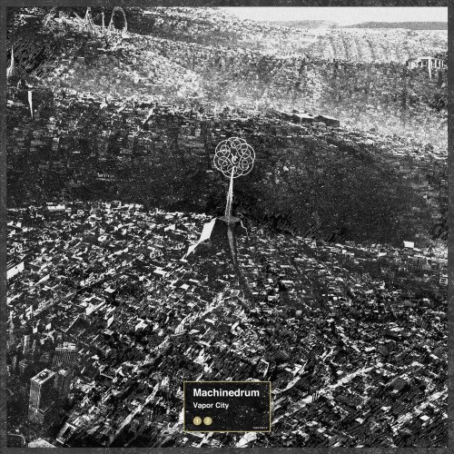
Machinedrum - Vapor City
Design: LuckyMe
Most ideas start off as a dream, figuratively speaking. Vapor City however, started literally as just that. Perhaps one of the greater uses of promotion and music-visual link-up's thuis year, was born right from Travis Stewart's dazed imagining of a distant city in all its thriving locale and cultural intrigue. And what best way to build on the album's strong subject matter and themes of artificial enclosure, then have such a Western metropolis displayed to us like a vast mark-making to the city's stand-out sights. The cover to Vapor City is both absolute yet intriguingly obscure and somewhat unfinished - parts to the cover's black-and-white sweep almost blurred and passed over without as much of a care to the unnamed map-maker of this fictional city. Yet, Vapor City's embodying of character is exactly that; hidden, mysterious, cautious but all the more vying to exemplify its more luxurious and ourist-friendly side to reel attention towards. The musical hotspots present on the album are too dotted about the imagery: the undercity suburbs, the white-hot glow of highways and city-block-stretching roads; Vapor City's shining insignia rising above like some media beacon or transmitter. But beyond that, the backdrop of what appear to be industrial stretches; vast expanses of open fields. And...a carnival maybe? It's the archetypical shot of a city ready to amaze yet franctically, and agonizingly, holding a darker societal side.
~Jordan Helm
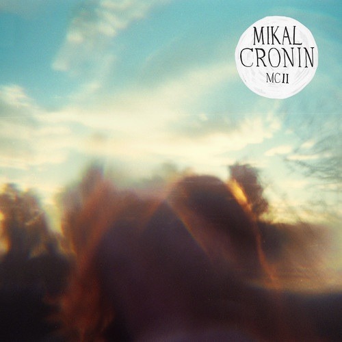
Mikal Cronin - MCII
Photography: Alex Uhrich
Design: Maggie Fost
Original Review
Merge Records in-house designer Maggie Fost has created some very
distinctive cover art over the last few years – Destroyer’s Five Spanish
Songs, The Music Tapes’ Mary’s Voice, and of course Mikal Cronin’s
MCII. Fost tends to turn stock images to life, using her imagination and
knowledge of said artists music. For Mikal Cronin, her art couldn’t be
more accurate. MCII’s cover features an evening sky appearing out of the
day – with silky brown heads vividly appearing just above the drop.
It’s the heads of Cronin and his team (you can tell by the curly hair.)
Fost doesn’t over instigate MCII, she leaves much of its cover up to
imagination. As MCII’s final track “Piano Mantra” comes to close the
album, one can’t help but look at the album cover and share the ‘over’
feeling. It’s the end of MCII, the end of the day, the end of an era so
profound in Cronin’s discography.
~Eddie Gibson

Suede - Bloodsports
Photography: Anuschka Bloomers & Niels Schumm
Original Review
The naive, young-love romanticism of previous Suede LP's comes to a
hefty, striking and quite violent end, and it's here in the imagery accompanying 2013's Bloodsports
- as much the title itself - reflects that change in a simple, but powerful
expression of action. Once lovers now relegated to
faceless, brutal, almost animal-like shells of their former selves; the
freeze-frame of this domestic incident finding the female yin attacking
her once male yang counterpart possibly out of frustration...or perhaps
worse, out of sheer desperation. And for an album that is full of links
to subjects on the decline of a relationship, the troubles between both
parties and the eventual fall-out/lashing-out, this is an image that
details a lot, but in its simplicity, worryingly leaves the onlooker on
tender hooks as to how dire this scene will evolve into. The irony then,
conceptually, is that while the album title flicks and curls its way
breadth ways in the same way Coming Up's lettering did, the deep red
tone and the more signatory, focused quality feels but a mere sorrowful
reminder as to the once happy and content romance (reflected in the cover of their debut album) this broken
relationship had once blissfully presented.
~Jordan Helm

Tim Hecker - Virgins
Design: David Nakamoto
Like the sounds that haunt the vast distorted space of Tim Hecker's seventh studio album, the cover to Virgins brings an immediate discomfort and feeling of malevolence despite the empty presence of the imagery. The photograph of a holy interior may initially bring connotations of collectiveness, security and faith, the desaturated tone of the colours as well as the way the thick black border seems to already loom into the image at top, only goes to emphasize the record's religious antithesis. It's an undeciphered malevolence and stripping-away of religion's more warmer-hearting aesthetics - the bareness of the room; the masking of a statue by a sheet; the unfamiliar presence of construction-related equipment - that reflects well into the heart of Hecker's sound which on Virgins is one of deteriation and disturbance. But more-so, it's a sound (much like the imagery) that lies finely balanced between abrasive and looming fear. And thanks to the sharp clarity of the image's centre, mixed with the looming translucency of dark at its edges, the imagery offerig Hecker's listener an introductory nod is as cold and hostile as the Montrealer's music has so marvelously been throughout.
~Jordan Helm
~Jordan Helm
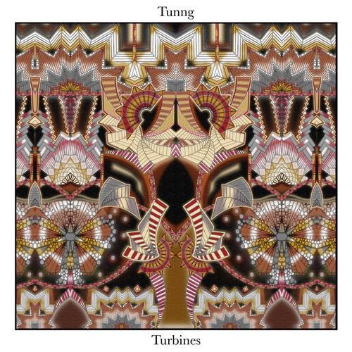
Tunng - Turbines
Artwork: Vanessa Da Silva
Not for the first time does a white-framed visual make its way into our Top 10 list this year. For Tunng however, the majesty of the album's lively, festive and often celebratory style of geometric shapes, works. The extravagant choice of colour - with its golds, beiges, browns and silver shades - makes for an intriguing and positively lively balance of imagery. The imagery itself, conjuring a feeling of what a grand stageshow would look like through kaleidoscopic lenses, is a fitting metaphor for a band who thrive on entertaining their listener without necessarly enforcing an element of over-zealous or over-excited performance. In all its abstraction and glitzy high-profile charisma, it's the charm and the collective assemble of the design that allows Tunng themselves to orchestrate a track-listing on Turbines that, this year, saw the London-based folk group expand upon their slowly-trickling and nimble instrumentation. The sleeve may laud the viewer with a host of shapes and colours of numerous sizes, but the intented presentation of numerous figures and forms - like the music - is gentle but reassuringly full of grace.
~Jordan Helm

Vampire Weekend - Modern Vampires Of The City
Following
the signature name-at-its-centre photography that their debut and
sophomore showcased, Vampire Weekend's third album offers a lot less
designated and tightly constricted visuals than the evening house or
80's model said records provided. What we have instead is something
that, as we come to learn, perfectly reflects Vampire's sound
conceptually while at the same holds with it a sincere degree of
cinematic scope. Taken in 1966 in New York City, the shot of a city-wide
smog coating the island in a shifting fabric of industrial cloud, is
indeed quite frown-inducing and sickening, especially to the most
greenest of spectators. But the drama and the sheer scale of the visuals
work well in playing to the US four-piece's almost-theatrical display
of rich lyricism and sailing instrumentation throughout the album. And
reminiscent of any 50's light-hearted drama the band seem to work so
well in recreating sonically, the grainy, disposed perspective is both
alien yet profoundly personal. A fitting description for the city that
never sleeps and a band never prone to off-days.
~Jordan Helm

Youth Lagoon - Wondrous Bughouse
Illustration: Marcia Blaessle
Original Review
Drawing
without any real basis of factual or surveyed objects, can go either
way when it comes to marveling at your own magnificent creation. You
either love it for its wild imagination, or despise for its irrefutable
lack of relation with anything [in the real World].
The cover to Trevor Powers' sophomore under the Youth Lagoon moniker,
much like the album, is a vast sprawl of dazed hues and childish
daydreaming, it's almost quite nostalgic in its likeliness to past
experiences. The very swirling, free-flowing, abstractness of shape and
form is completely free to do its own bidding, yet there's still that
underlining motion and expressiveness that comes through amid the
countless scenes and metaphysical locations being offered. Visually,
it's the equivalent of a child's fantasy been free to pour out his/her
thoughts instantaneously. But sensually, as mentioned in my review, it's
the equivalent of pouring a full ice-crushed Tooty Fruity smoothie,
gallons of fruit juice and countless fruit-flavoured, fruit-soured
sweets/candies into your mouth, chewing them and simply frolicking in
the overwhelming intensity of flavour and delight. This could in a sense
be the tastiest and fruitiest inducing of imagery so far - GLUG GLUG
GLUG, OM NOM NOM a plenty.
~Jordan Helm


