
 |
| 5. Matthew Dear - Beams |
This expressionist-like presentation of thickly-applied paint bodes well
for Dear's 2012 release, given how the album feels (in the same way)
muddied and greased with the same texture of oily color and thinning
textures each running into one another. Much like the cover's contrast
of thick, runny paint and thinner blends of tone, the album at many a
time blends and clashes at the perfect opportunity and Dear himself -
through his deep baritone lyrics - is that very same colorful but humble
nightclub snapshot.
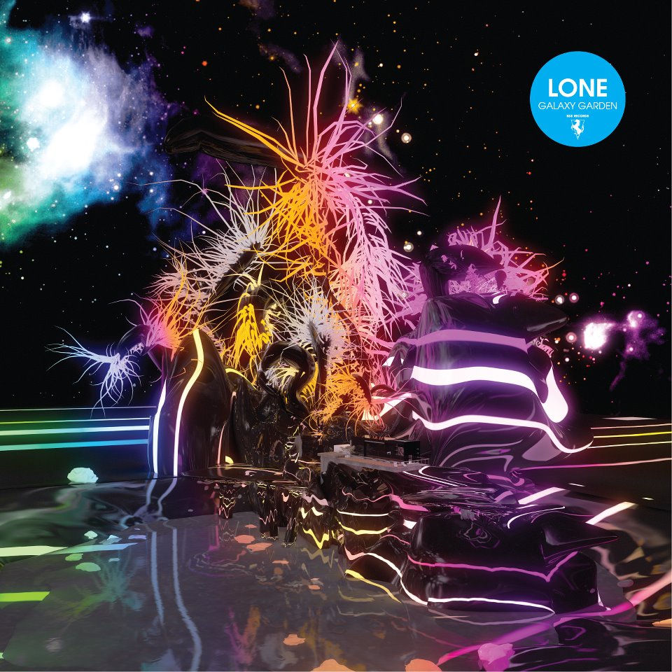 |
| 4. Lone - Galaxy Garden |
I imagine discos and even some bars might have some kind of installation
that mimics this type of scenery in a few decades. It's the perfect
visual depiction of music that is as much about the energy and the
enjoyment, as it is the lush combining of textures and differentiating
ideas in electronic music. A wondrous cosmic collage of 3D geometric
abstraction, 2D space imagery and an overall feel of spectacular
bewilderment; it's like TRON meets 2001 meets Interstellar 5555.
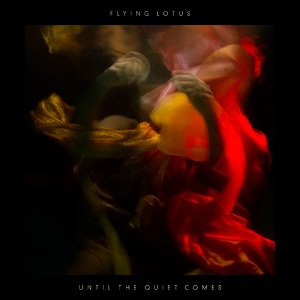 |
| 3. Flying Lotus - Until The Quiet Comes |
To this day, I still have no clue either what, both, these forms are and
what exactly is taking place at this given time in the image. But for
Lotus' forth album, it feels more like the perfect metaphor (however
you'd hope to describe it) for an album, veiled in this same earthly,
organic and humble attitude. And as opposed to the space-lunged trip of
Cosmogramma two years previous, this album makes its darkly intimate
visuals seep through with every bite-size compact sound after the other.
And while the actual sound did indeed feel like individual snapshots,
the record's cover certainly feels a lot more like a sole identity
aiming to signal the emotion and the feeling of interconnection.
 |
| 2. Swans - The Seer |
Anyone unfamiliar with Swans will certainly feel a slight sense of
insecurity and anxiousness about whether to hear what lies behind this
pastel-drawn image of a savage fox-like creature - teeth-gritted, eyes a
deep black, its presence remaining to an extent fixed to the darkness
around it. I knew The Seer would potentially be a far textured, intense
and, dare I say it, Swan-like record than previous. And while I wouldn't
necessarily say the visual best describes the lyrical display and, at
times, emotion of the near 2 hour album, it does however best describe
my initial heightening of a response to the cover...or rather, the lack
of one.
 |
| 1. Holy Other - Held |
Like Oneohtrix Point Never's Replica in 2011, the instinctive
presentation of humanity, and the lack of it, in the album artwork, was
instantly felt by the time I'd finished listening to the record. The
cover, depicting the weighted creases to a bed sheet, leaves the
question open as to whether there is a presence even here inflicting
such a physical force. And much like the cover, Holy Other's debut LP
was a hazy layered mix of phasing voices moving in and out of sheer
existence. Not only did it emphasize the nature and hard-hitting effects
of vocal usage and its accompanying layering, but so too it drew our
eyes to the age-long question many a philosopher has attempted to
answer: what is existence?
~Jordan


